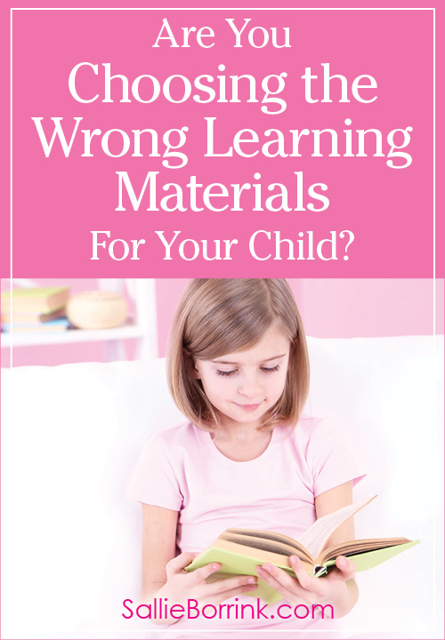
One of the things I’m passionate about as a homeschooler is that learning materials for young children should be visually engaging, colorful, well-designed, and simple. Reaching this balance is a challenge, but it can be done. I’m really picky about the aesthetics of any materials I use with Caroline whether it is a worksheet, a book, a lapbook, or a game.
Caroline is also very particular about the way things look. If she doesn’t like the look of a picture book, she has zero interest in the content. (She totally gets that from her mother.) Even when she was tiny, she strongly preferred colored activity pages to black and white. She has never been a fan of coloring books, but eats up colorful sticker activity books.
It is very important to rememeber that:
- Some kids crave color.
- Some kids require quality aesthetics.
- Some kids need simple design.
I pass by many educational materials online because they aren’t visually appealing. It doesn’t matter how good the content is. If it isn’t enjoyable to look at, I know it won’t fly with my creative, right-brained daughter. She wants to be around things that are visually pleasing.
She also doesn’t want to use things that are over-stimulating. Many products seem to have been developed under the “excessively more is more” idea. Too many graphics, wild fonts, and weird layouts aren’t helpful. It’s too much for many children and distracts them from the real learning task at hand. I wonder how often children resist doing work because the page is simply too stimulating and distracting. It isn’t that they can’t do the work. They are just too distracted to focus. Their eyes don’t know where to go because there is so much on the page. They need learning materials that are distraction-free.
This is why my products are created primarily in color and with a simple design. I work very hard to find the balance that works best for children.
I’ve started developing a line of lapbooks that have quality graphics and color photos. I love lapbooks and they are great for my hands-on learner. But I’ve had a difficult time finding ones that are colorful and visually appealing with strong design. So I’m going to create them for Caroline and for other children like her who really need them. (I am also creating them with minimal writing involved for children who struggle with dysgraphia, but that’s another post!)
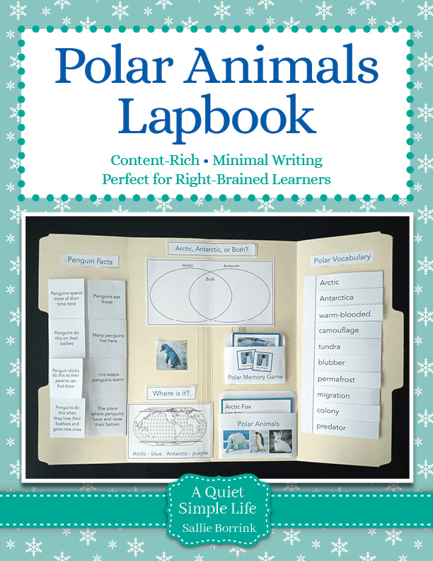
We’ve started using the first one (Polar Animals Lapbook) and Caroline loves it. The design is simple, but appealing. I also included lots of colorful photos. Yes, it does cost a bit more to print them compared to if everything was black and white, but I think the trade-off is worth it. The most important thing to me is helping her engage with the content in meaningful ways without being distracted by everything else. So far, so good!
So if you have a child who struggles with learning activities, please consider that perhaps he or she is looking for something that you haven’t been offering in terms of design, color, and aesthetics.
- Are the materials you’re using visually boring?
- Or are they excessively stimulating?
- Does your child crave some color?
I suggest observing for several days and see if you can notice a pattern in terms of what quickly engages your child and what turns into an exercise of frustration (for both of you).
You might be surprised what you discover!



 7 Keys To Homeschool Success
Leave a Reply